To increase the appearance and functionality of the website, in order to sell the new album we decided to create a website banner in order to promote the music artist Ava and her work!
From our research into music artist websites, such as Pixie Lott's, we have picked up on the important aspects and features within the site, such as the promotional banners.
Our own photoshopped banners:
As part of our website/campaign for the 'Ava' album release, we have constructed a few banners to put on the website in order to give the website a more professional and promotional look.
Why we looked at this video?
As our own idea for the music video is heavily focused on lighting, this specific music video has great examples of how we could incorporate different light styles in to our own music video.
How its influenced and helped us?
The main focus is from the middle part on the video onwards as this is where the lighting becomes more of the focus and becomes more direct. As it is then night time, which is the time that our music video will be filmed at.
The use of the different lighting notions such as disco lights and the framing of the artist, with the lighting behind her.
The quick cut shots of with the different lighting and locations matches the beat of the music to keep it consistent and fast paced.
We particularly the use of the sparkler, which we initially had the idea of, but through seeing it on a professional video we found ways of using it. The variety of creative shots such as the Bokeh effect of the blurred focus of the spot lights. This is the type of creative shot that we want to incorporate a lot of in our own video.
We do need to consider that when we do perform the shots of her in the dark with the different light styles that we film under good lighting conditions to highlight singer as it can look poor and bad quality if the conditions are too dark.
- Ensure the clips start at the same time (apply in-points) and end at the same time (out-points) in time with the music track, in order for a successful multiclip.
- Create a folder to place the clips intended to be used for the multiclip in a named 'bin' folder.
- Select the videos which you want to apply multiclip to
- Click 'Modify' and then 'Make Multiclip'
- The multiclip dialogue box will open, displaying the in and out points of the videos.
-The group of clips will be displayed as a multiclip file name.
- The videos will be displayed in one viewing box into 4 sections (if there are 4 pieces of footage)
- Click on the 'View' pull-down menu and click on 'Show Multiclip Overlays'. This is so you can see each clips' angle number, name, and timecode.
- Click on the 'Playhead Sync' pop-up menu in the 'Viewer' and click on 'Open'
- Whilst playing the multiclip videos at the same time, select the videos you want to be played whilst the music is played - this will cut the videos in time with the music where selected.
- Whilst playing the clip in the Timeline and selecting different camera angles in the Viewer, the multiclip will play. When pressing the space bar, your angle switching, or edits will show up in the Timeline.
Need to talk about: - How was it filmed? (from start to finish) - Programme used To put / cut the film footage together and add effects to the footage, we used a programme called.... This enabled us to have a practise on the programme and be able to have some experience with it. - problems occurred -Effects? (experimenting, some we might use?) - Evaluation (how has this practice helped? considerations to make when making our own video? what would you do differently?)
As part of our research, we have both researched into the types of audiences similar artists and the similar music to our own style song and music artist.
We have looked thoroughly into different sources such as popular social networking sites; Facebook, Twitter as well as the artists own websites. We looked at other sources of finding out the audiences of similar artists.
Pixie Lott Audience Research:
We both looked at Pixie Lott's forum / discussion section on her website, allowing members and fans to comment on particular topic. By looking into this particular feature on the website we were able to have a general idea on the types of fans/audience that Pixie Lott and her style of music appeals to. Many of the fans commenting and writing up on the forum are mainly female, however there are many male fans also commenting on the forum also.
We had come to the conclusion that an artists like Pixie lott would probably have a mix of a female and male audience as she is a good female role model and sex appeal for the male audience.
We took a look at Pixie Lott's page on facebook to look at the type of audience she has logged on her own page. We got a numerical representationof the number of people who 'like' her as well as the number of people 'talking about' her.
By looking at her friends list, we noticed that the audience does seem to have alot of female audience, however there are many male interests as well!
We took a sample of the friends on who have liked her facebook at found that most of the audience she has attracted is the teenage/young adult audience, as well as a few from either end of the scale.
Similarly, we took at look at the type and the number of audience on Pixie Lott's twitter page. By taking a look at her 'followers' there is a similarity in the type of audience to the Facebook page.
Ellie Goulding Audience Research:
We took a look at Ellie Goulding's website and found a similar feature to Pixie, a discussion forum, showing the discussion boards of the fans of the artist.
Similarly to Pixie Lott, the main audience that appears to be for Ellie Goulding is a mix of females and males, ranging in ages - but mainly based around teenagers and young adults (similar to the artist's age).
We took a look at Ellie Goulding's facebook page and analysed it the same way in which we looked at Pixie's, and took into account the number of fans, the type of audience (including; gender, age and style of person)
By looking at Ellie Gouldings' Twitter page, we were able to get a more deeper look into the type of audience/fans she has. We we able to see the number/people who have 'followed' her and written on her wall and noticed the type and age of audience she has attracted, approx 17-21.
Through YouTube, Artists are able to upload their latest videos which will be seen widely around the world therefore attracting their audiences. A small profile can be created in which this will show fans information about the artist and their interests. Below is a screen shot of comments shared by those who follow the artist.
Our own Primary Research into attracted audience:
Twitter:
As part of our creative research for the types of filming we want to include within our music video, we have looked at 'Bokeh' which is the aesthetic quality of the blur,in out-of-focus areas of an image, or "the way the lens renders out-of-focus points of light.
We have included a few sample videos of what we intend to achieve as part of our music video to keep to the concept of 'lights' and make the music video visually appealing.
Within our media lesson, we both had a meeting on the rest of the things we need to be done by the end of the week, for successful development in the future!
In our meeting, we went over trying to finish and develop our storyboard to be later developed into an animatic to represent our idea in a better way.
We also went over the left over pieces of research we have to do within the week..
Research and planning to do:
Storyboard
Animatic
Audience research / moodboard..etc (needs to be detailed and supportive!!)
Shot-list
Production schedule
Asset List
Test Shots (profile)
Pictures of locations
Risk Assessment
Call Sheet
What we did within the lesson/meeting
Drawn up some more post-its of the story board
Caught up on what we need to do...
Talked about the digipack/website for the release
Deadlines...
Today we had a meeting to discuss the following points: Lighting styles and effects, Possible locations, Actors and influences for camera shots, angles and techniques. All in preparation for our final idea.
We both met up in the holidays in order to get some of the work done together and go through some important points that we needed to have ready for when we go back to school.
Meeting
Discussion Points:
Lighting ideas:
- Light incorporations (different focus on the lighting objects, faces)
- Colour scheme dark/natural with multicolour lights from different objects and light sources such as L.E.Ds, fairy/christmas lights, street/city lights, the moon, reflections from glitterballs and other objects.
- Considering the use of florescents and UV-paint on the artist and from objects.
- Fireworks/sparklers.
Lighting is the crucial element within our music video, as we want to incorporate fantasy with hypereality. Also by varying the light sources and objects we can produce inspired techniques and shots which will deliver an effective and exciting music video.
Location ideas:
Lights being the main concept of our music video we need to really consider locations which will intrigue the audience. We have expanded our location options ready to follow up, for further research and visits.
- London will be our most used location as this is the music capital, it can represent dreams and possibilities. Through using the iconic buildings and the lighting around we can be very creative.
- London has very appealing scene which will entice the audience.
-Different settings: river scene, studio, city.
Actor requirements:
- Think about auditions for the positon of the female Arstist. The three possible actors? Any extras needed?
- Characteristics of the actor: Most crucial factors:- confident, reliable, good communication skills, strong and dynamic. Bonus(?) features/important:- Attractive, portray a good female role model image, professional, good acting skills.
- Overall image of the Artist: Independence, strong female role model, innocent, attractive, stylish/fashionable.
- Image that will sell the band?
- Artists appeal towards the audience/ creating connections?
- Creating an identity for the artist.
- Considering our target audience which will be females (in early 20's) young adults/audlts. Can appeal to males because of sex appeal, but mainly girls/women because of fashion, role model figure, independence.
Inspirational Videos:
Here we have included some videos that we viewed whilst working together in order to get some inspiration on the points that we had raised within the work time.
Most of the videos below show some creative shots including effective lighting, locations and editing techniques.
What caught our attention in this particular video was the use of flashlights to highlight the singers face in the dark and how the dancers used them in a line to enhance the movement.
When we came across this music video, what caught our eye was the multi-coloured fairy lights used and how it made the shot look more appealing. We also noticed that the use of a projection on the singer highlighted her and made the shot look more interesting.
The main thing which stood out to us both in this music video was the editing effects used, such as quick cuts and video montages - creating a nice faded effect of two or more different videos.
When looking at this video, we liked the use of bright lighting set behind the person, thus creating a silhoette and making the person stand out.
The use of a spot light on the music artist stood out to both of us, as it is effective for making the person stand out and appear more visible in the shot.
What inspired us both in this music video was the use of lights, projection and creativity to make the music video more visually appealing and interesting.
- UV LIGHTS..
Both Lauren and I analysed the lyrics to come up with a understanding of the song as well as a concept for the music video idea.
We listened to the song a few times over to have a better idea on what the lyrics reflect and what the lyrics of the song mean. First of all, by reading the lyrics, we noticed that the song mentions the word 'lights' frequently and we made the assumption that the song could have a direct meaning with the artist. For example, by the artist talking in the first person 'in my head' and 'You show the lights that stop me turn to stone, you shine it when I'm alone.' makes the song seem more personal and relate to the audience.
When we took a listen to the song itself, we noticed how the lyrics have been repeated and 'jittered' (e.g. had a way-h-h-h) to add an effect to the song. As this particular song has a ambient but dubstep sound to it, we thought of maybe including an aspect of hyperreatlity to the story and to suit the style of the song. For example, with the repeated words and sounds of the lyrics, we thought of maybe portraying the artist in the music video to be a computer generated human in order to refelct the lyrics and style of the song and create an image for the artist based on futuristic and unique.
We concluded that the artist of the song may be expressing her relationship with lights and how it reflects her as a person.
We have included some more examples of music videos that have inspired us on parts of our own music video. We concentrated on the framing of shots and the content within them.
A particular aspect of this video which stood out to us both was the use of projection to create a good lighting affect as well as an effective silhouette of the singer.
This video inspired both of us because of the focus on the lighting enhancing the appearance of the female music artist, presented as an attractive young woman. We also looked at the types of editing involved in this particular video, such as quick cuts from shot to shot in the pace/beat of the music. We also took note on the style of the video in relation to the style of the song, being set in a club with lots of colourful lighting.
What caught our eye in this particular video first of all was the introduction of the sunrise against the silhouette of London, which looked visually appealing and appropriate as a music video opening.
We also found the editing of the music video very effective, where the paintings had been filmed for a few seconds and then changed to created a 'jittered' style.
We also liked the look of the luminous paints in a dark room to make the shot look more appealing and interesting.
When looking at this particular video we admired the use of fireworks to make the video more visually enhanced as well as relating to the title of the song 'Firework'.
We also enjoyed the use of the lyrics relating to the visuals of the music video, such as the people being shown as if they/and everyone else should show of their potential.
In this music video, what stood out to us was the use of hyperreality applied to the singers and actors of the song. The use of a hologram effect creates more a more futuristic image, as well as suiting the style of the song.
Features found on Digipak example:
- Front cover artwork (photograph or image)
- Title of band and album name
- Audio CD
- Bonus CD (DVD)
- Sticker
- Booklet
- Contents (Song names, found on back)
- Images
- Lyrics
- Poster
- Barcode
- Record Label Logos
Fall Out Boy – Digipack analysis
What are the dimensions of the digipak?
Front cover: 12.5cm (height) by 14.3cm (width) Spine: 12.5cm (height) 0.9cm (width) First opening of digipak: 12.5cm (height) by 29.8cm (width) Fully opened digpak: 12.5cm (height) by 58.5cm (width) cd - diameter 12 cm
What are the conventions of the form and layout of a digipack?
How do they contain conventions of the Genre of music?
On September 13, 2008, the album artwork was revealed on the band's website. The cover of the album was painted by artist Luke Chueh. Chueh used the title and underlying themes of the album as inspiration for the artwork. "The title of the album is Folie à Deux, and when considering this with the bands popularity, I chose to focus on the idea of fandom, and how some people are willing to take their love/infatuation to levels that are obviously unhealthy."The disc's liner notes contain pictures of the band members with blank pages next to them; the group allowed fans to submit pictures they had drawn in the spaces and posted them to the band's official website.
Folie à deux from the French for "a madness shared by two" is a rare psychiatric syndrome in which symptoms of a delusional belief are transmitted from one individual to another.
The digipak is the deluxe edition of the bands release, consisting of the audio CD as well as a free double sided poster. The digipak is made from a glossed card material.
The front cover of the digipak
The front cover has a bright, graphicly drawn piece of art; a surreal image of a person (Pete Wentz the bassist of the band) dressed as a bear - with a 'real' bear upon his shoulders. This particular style of an album cover isn't seen in most album covers, which either usually have the artist/band on the cover or something relating to the album name. The background is deep red with the title of the band 'Fall Out Boy' in white and the album name 'Folie á Deux' in yellow (matching the front cover characters costume. These colours and graphics have been used so they stand out to the viewer from the deep red background and presenting the band in a more surreal and darker light - highlighting the style of their music and personality/image.
The graphic of the album cover has been used on the poster as well as the band website, whilst the CD was on sale. This allows people to relate the graphic to the bands album.
The inner section of the Digipak:
The first stage of opening the digipak product reveals a plain, red painted style cover. In my opinion, I see this to be quite plain, however, it is a good way to blend the front background styling with the inner section of the digipak.
The first opening of the inner section:
As you open the first inner section of the digipak, it reveals a bright, colourful graphic/photograpy image of two of the band members. This is a complete contrast to the outer and inner parts of the digipak. I think this is an effective way to incorporate two stylings into one digipak.
Analysing this style of artwork, makes me think that each of the different band members have different graphics and images place upon their photograph to highlight certain parts of their personality and styling which makes the band more interesting and different to other band stylings.
The Digipak product reveal of the inside:
The Digipak consits of four separate card squares, to allow an even reveal of the product. As the other side of the inner section is opened, the other two of the band members are revealed with the similar styling of graphic images placed across parts of their face.
On the first out of the four sections of the digipak, holds the audio CD. It is kept in a sleeve of the glossed cardboard material and is secured in place with the small gap of the card.
The Audio CD:
The thing which stands out the most about the CD is its bold colour choice, yellow. Considering it is one of the brightest colours, it has probably been chosen for a reason, such as being easy to see out of other CDs. It also matches the colour of the drawing on the front of the album cover aswell as the album name on the front. This keeps the digipak product as a complete package and keeps it relevant to the smaller features.
The CD includes the record label names involved with the production of the album.
It also includes the producers and copyright in small text around the circumference of the CD.
The Poster:
The poster is kept on the right hand side of the opened digipak. It is folder over three times in order to fit inside the card pocket.
The poster features a large image of the album cover with the album name printed in bold underneath the image. On the other side, it features a photograph of the band together. They are presented in similar tones of coloured clothing, such as black and ark shades of greys/greens. Above the band members, is text containing information of the band members names, information of the creators of the songs, record labels and other information. The final paragraph presents a little thank you message saying 'THANK YOU TO ALL OUT FANS, FRIENDS AND LOVES'. It also includes mentions of other companies involved, such as Fender, Marshall, Dunlop... and so many more! It also includes more wesbite addresses linked to the band.
The spine of the album:
On the spine, it features the logo of the 'Mercury Music Group' record label to highlight the bands music producer. It also has the band name and album name in both in a bold and plain text. This style of text makes the names stand out more and make it look more interesting.
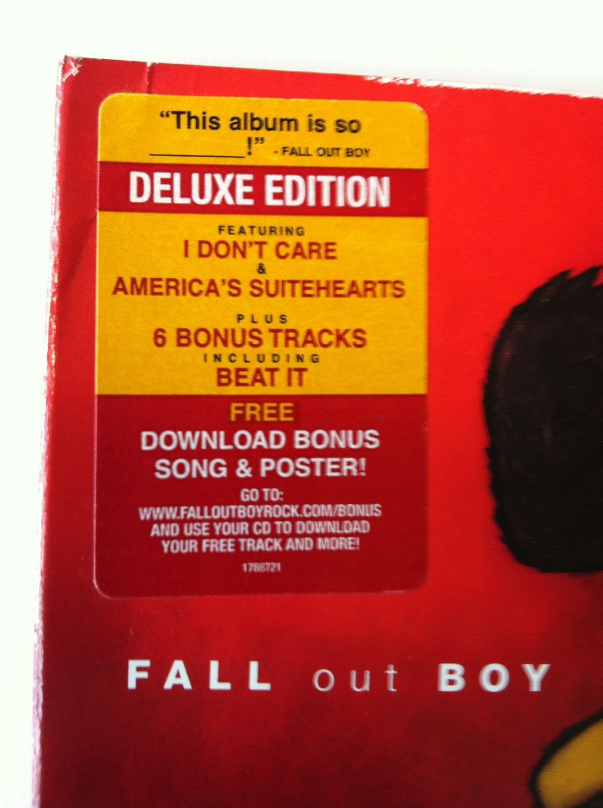
The sticker:
On the top left corner of the front of the Album Cover, It provides information to the viewer of the product to see what features it may include, such as main features of the product (names of the most popular songs) as well as the information of the free poster inside. It also gives information on the website address to download a free track!
Here is the digipak opened to stand up and reveal the inside photos of the band members.
Here is an image taken, diplaying the inside of the digipak opened to stand upright.
The back of the album:
The most interesting feature of the list of song names is that they are purposely shown as if they are back to front. The reason for this is to shock the viewer and make it more interesting. Strangely enough, it is still easy to read the song titles.
The album names are the same colour as the bear character as well as the same colour as the album name.
The back of the digipak bottom left hand corner:
The bottom left of the digipak displays three of the record company names involved with the development of the band album: FueledByRamen, Decaydance and Mercury Music Group.
It also displays website address' of the bands website and main record label. Underneath, it give information about the date of the making of the CD as well as the copyright law briefly mentioned.
The back of the digpak bottom right hand corner:
The bottom right hand corner of the digipak has the barcode, in order for the album to be scanned and purchased.
The complete product of the digipak:
- Outstanding photography with the incorporation of graphics
- The Audio CD
- The Fall Out Boy poster
How does this reinforce the band image?
The styling and content within this digipak does continue to represent what the bands image and styling is about. Fall Out Boy have been commonly referred to as an emo/scene style band, in reference to their music, lyrics and main focus of bassist Pete Wentz who is thought of as an 'emo'.
However, the bands main goal is to be unique and reach out to those who might relate and enjoy their music and lyrics.
Fall Out Boy tend to be unpredictable in terns of the album covers, for example, Infinity on High, Believers Never Die and From Under The Cork Tree all have very bizzare and surreal album overs which, for many, tend to not give away the meaning behind the artwork.
Their different approaches to albums and style of artwork give the band a sense of their own self and style and shows they try to not be like other bands already out there.
Examples:
Rihanna Digipak:
Emily Osment Album Cover:
More examples of Album Covers:
Here are the examples we looked at for ideas for our own digipak. The reason we picked the ones being shown all have certain features that attracted us. (seen as we are in the target audience)
When researching on the internet on album covers, many of the results of album covers were alot of the female artists close-up, to show their attractive appearance and to interest the viewers.
We are looking to incorporate a 'lights' within the front cover to follow the concept. Especially in Beyonces' cover, where the sun is being forced through the window.
From the shots below, these were taking from the Series 'The Vampire Diaries' where we received inspiration through shots that came to interest. Together we think these are great template influence for our own digipak cover. However, we would be more creative and will manipulate the colour scheme and different contrasts etc so it will be enticing.
Our thoughts and considerations about our own to be made in the future for our own construction of a digipak:


