Front cover Draft 1:
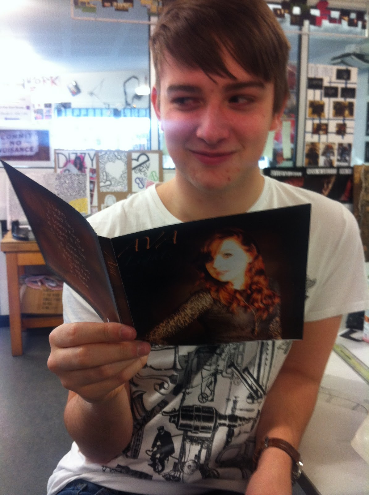
Inside Front cover
Use of Bokeh as a background image with the face overlayed on top.
Motion blur was used on the Bokeh Background image to make more discrete.
Altering the Contrast and Saturation of the image so that it is more golden.
Sharpen of the eyes, after the Gaussien Blur.
Digipak Draft 1:
Feedback on first draft:
- The front cover and back cover scales do not match in colour style, however the photos used are nice and the editing used are good.
- The middle pages, are creative and look really creative, you should incorporate more of this style for the front and back covers.
- The font styles used on the front and back are different but they are nice fonts. The font used on the back cover suits the style more of the band and song style.
- Really good for a first draft with the photography and shots used, however the style of colour could be more consistent with the website, with more darker scale colours such as browns, possible greys and blacks? other than that it has a good brand identity and suits the style of genre.
CD ROM:
As part of the digipak designing, we thought it would be a good idea to also create some visual representations and ideas for the CD itself.
I (Aimee) created a few draft ideas of the CD, whilst lauren was editing the digipak pages. I created the outline of the CD itself and included some of the photos/images we had taken from our filming, photoshoot and general days out to gather creative light footage. I have selected images which will reflect the complete package of the music video, website and digipak as a whole and keep the style consistent (using blurred lights - similar to the creative shots used in the music video and title of the song)
Final CD Rom design:
Lauren and I agreed that this particular CD Rom design was the best out of them all, in order to keep the digipak consistent in design and suit the concept and styling of the music video.
Draft 2:
Removal of the background, so it can be replaced with a black background. Tools used, were the eraser and Magnetic Lasso.
This was done for two images so a mirror type effect could be done.
Images were cut and pasted onto a new document. Where one image was selected to be mirrored.
A border was creating by a box. This was changed to a colour similar to the artists dress.
This was followed by creating the Bokeh lighting effect by creating circles by using the paint brush but altering the opacity for different shades.
Front Cover:
Inside Front cover:
Inside Back:
Front Cover Draft 3:
Using photoshop, I (Aimee) had a go at designing a front cover using on of the photos Lauren and I took on the photoshoot day. Using various tools such as brightness and contrast I was able to improve the quality of the image. Using a particular circular 'brush' tool and adjusting the 'opacity' to give it the same appearance and style as the blurred lights within our music video. I included cursive/handwritten styled text to fit appropriately with the style we were aiming for, matching the colours in the text to compliment the colours in the picture.
Back cover:
Using the same layout as the front, and to keep the digipak consistent, I used the same background images as the front so that both sides related. I framed the outer edge with a blur tool in order to make it look more clean and creative. I used a text called 'Bellerose' as it looked simplistic, easy to read and fairly clean cut - suiting well to the style of the digipak.
To make the digipak look more convincing, I used a couple of CDs by Jack Johnson and Plain White T's as a reference, and looked at the small print and other features they appeared to have.
On the back of the digipak, I put in a barcode, the 'Bokeh Productions' logo, a logo for the marketing producers L.A (Lauren and I :p), the website link to the artist website and some small print making up some rights/dates of the CD and its 'owner'.
Development/photoshop of final digipak:
Using photoshop, I placed in each of the individual sections of the digipak (Lauren's inside content/imagery and my front/back cover) into one file.

Using photoshop, I generated the spine to match the front and back cover and to give the Digipak more depth once it was printed. Using same background, I added the text so it was aligned in the right direction and included the 'Bokeh Productions' logo we created.
Spine:
To keep the digipak looking professional and give the prototype some depth, I (Aimee) created the spine so that it matched the front and back, and included the same text/title as the front so it kept the styling the same. I also included the production logo to make it look more realistic.
Once they were laid out the right way up and in the right place, I printed it off and we were able to have a feel for how it looked.


