Monday, 16 January 2012

Website Banner Research and Development


To increase the appearance and functionality of the website, in order to sell the new album we decided to create a website banner in order to promote the music artist Ava and her work!
From our research into music artist websites, such as Pixie Lott's, we have picked up on the important aspects and features within the site, such as the promotional banners.

Our own photoshopped banners:
As part of our website/campaign for the 'Ava' album release, we have constructed a few banners to put on the website in order to give the website a more professional and promotional look.


Photoshop processing:
original..
photoshopped...


Original...

Photoshopped...


Friday, 13 January 2012

Digipak Development (draft 1, 2 & 3 and cd)

Front cover Draft 1:

Inside Front cover

Use of Bokeh as a background image with the face overlayed on top.
Motion blur was used on the Bokeh Background image to make more discrete.
Altering the Contrast and Saturation of the image so that it is more golden.
Sharpen of the eyes, after the Gaussien Blur.

Digipak Draft 1:

Feedback on first draft: 
- The front cover and back cover scales do not match in colour style, however the photos used are nice and the editing used are good.
- The middle pages, are creative and look really creative, you should incorporate more of this style for the front and back covers.
- The font styles used on the front and back are different but they are nice fonts. The font used on the back cover suits the style more of the band and song style.
- Really good for a first draft with the photography and shots used, however the style of colour could be more consistent with the website, with more darker scale colours such as browns, possible greys and blacks? other than that it has a good brand identity and suits the style of genre.

CD ROM:
As part of the digipak designing, we thought it would be a good idea to also create some visual representations and ideas for the CD itself.
I (Aimee) created a few draft ideas of the CD, whilst lauren was editing the digipak pages. I created the outline of the CD itself and included some of the photos/images we had taken from our filming, photoshoot and general days out to gather creative light footage. I have selected images which will reflect the complete package of the music video, website and digipak as a whole and keep the style consistent (using blurred lights - similar to the creative shots used in the music video and title of the song)


Final CD Rom design:
Lauren and I agreed that this particular CD Rom design was the best out of them all, in order to keep the digipak consistent in design and suit the concept and styling of the music video.

Draft 2:
Removal of the background, so it can be replaced with a black background. Tools used, were the eraser and Magnetic Lasso.
This was done for two images so a mirror type effect could be done.
Images were cut and pasted onto a new document. Where one image was selected to be mirrored.
A border was creating by a box. This was changed to a colour similar to the artists dress.
This was followed by creating the Bokeh lighting effect by creating circles by using the paint brush but altering the opacity for different shades.

Front Cover:

Inside Front cover:

Inside Back:


Front Cover Draft 3:
Using photoshop, I (Aimee) had a go at designing a front cover using on of the photos Lauren and I took on the photoshoot day. Using various tools such as brightness and contrast I was able to improve the quality of the image. Using a particular circular 'brush' tool and adjusting the 'opacity' to give it the same appearance and style as the blurred lights within our music video. I included cursive/handwritten styled text to fit appropriately with the style we were aiming for, matching the colours in the text to compliment the colours in the picture.

Back cover:
Using the same layout as the front, and to keep the digipak consistent, I used the same background images as the front so that both sides related. I framed the outer edge with a blur tool in order to make it look more clean and creative. I used a text called 'Bellerose' as it looked simplistic, easy to read and fairly clean cut - suiting well to the style of the digipak.
To make the digipak look more convincing, I used a couple of CDs by Jack Johnson and Plain White T's as a reference, and looked at the small print and other features they appeared to have.
On the back of the digipak, I put in a barcode, the 'Bokeh Productions' logo, a logo for the marketing producers L.A (Lauren and I :p), the website link to the artist website and some small print making up some rights/dates of the CD and its 'owner'.

Development/photoshop of final digipak:
Using photoshop, I placed in each of the individual sections of the digipak (Lauren's inside content/imagery and my front/back cover) into one file.


Using photoshop, I generated the spine to match the front and back cover and to give the Digipak more depth once it was printed. Using same background, I added the text so it was aligned in the right direction and included the 'Bokeh Productions' logo we created.

Spine:
To keep the digipak looking professional and give the prototype some depth, I (Aimee) created the spine so that it matched the front and back, and included the same text/title as the front so it kept the styling the same. I also included the production logo to make it look more realistic.


Once they were laid out the right way up and in the right place, I printed it off and we were able to have a feel for how it looked.


Thursday, 5 January 2012

Rough Draft Feedback Gathered


    Here is the feedback we gathered from our rough draft music video. We collected the comments via youtube and the facebook generated for 'Ava':
    Yvonne (17 years) - "I think it's come such a long way, I love all the use of the different lights, colours and jumps which sync with the music. The lip syncing matches. My only little constructive feedback that I can give is that there is slight camera movement in one shot of her walking. You could probably overlay a stronger light shot over it so it isn't so obvious or put in another video shot. However I'm just being picky. It's really well edited and I like the Song."

Katie A (14 years) - "That's really good it looks really professional!"

Alice (18 years) - "This is fantastic, I love the shot of lizzie lying in the box with the lights!"

Danny (17 years) - "OMG that is suck a sick video, you will have to tell me the places you filmed :D"

James Pt Few - Wow, awesome tune... Top fun!! X  

 Charliiee 'mush' Armstrong (18years) - U really like the video and the use of the lights they look pwetty and so does Lizzie !!!!!!

Louise Ogrady -  Excellent video, like it xx

jn1910 - I really like the use of lights you use to overlay each image effectively. And I love the way you have edited the lip syncing around the remixed vocals. Another thing I like watching from an audience perspective is how you've both managed to keep me interested throughout the video.
My only piece of criticism is that when filming outside, maybe Ava could've worn her her up as the wind blowing her hair around her face distracted me XD
really love this video though :)

Lizzie (18 years) - I really like the use of both types of shots in the studio and in London. I also really like the way that you have overlapped some of the shots. There is a good amount of effects used as it doesn't over power the piece. I don't think shots using the projector work as the shaded put on the actor face isn't very flattering but other than that Awesome video guys :)

Kyle - Very impressive video! I wonder if there is any way of incorporating a plot which would help to expliain the song and compel the viewer to watch the whole thing.

Alex.W (19 years) - yeah good video :) i thinks that there is a bit to many shots of lizzie singing the song, I'm thinking maybe you should get shots of her walking down the street with the lights of traffic coming though underneath, have like have the camera so it like does a fly by past her shoulder or something like that. its very good though :) well done. btw you don't have to listen to my comments they are just suggestions.

Mattlikespiano - This is a really good music video! I like the way you kept the video in context with the name of the song, including lots of different types of light such as sparklers, traffic etc. The lips are synced really well with the vocals, I like how you've also added the remix vocals as well. My only real criticism is that I found, personally, that there was a lot of blur. This might have been something that you added as an effect, I just found my eyes where straining for focus.
Overall: Brilliant.

Jack (18 years) - Hey this is jack. I really like how the video has been put together because you did pick a hard genre to make a video to but you have managed it very well. I like the use of overlays and dissolves this helps keep the transitions fresh and smooth and also keeps it all in time with the music. I also like the diversity of the shots used because that helps keep it interesting and you also managed to get some popular sites in there too and this will help the artist appeal to a broader audience.
I also like the editing around where the vocals have been remixed that is good. The only criticism I woud have is that some of the shots where a bit windy and this sort of appeared messy but that is the only thing apart from this I think you have done a wonderful job and you have obviously spent time editing it and making sure its all perfect so well done guys.

Obed (17 years) - The video is great. The cuts are fast paced like the music itself. I like the way you layer clips on top of each other to make the clips more interesting. The lip-syncing is near perfect. The only criticism i have is that effects. Some clips especially the projection ones need more contrast. :)

Very good use of lights and stuff
Stupidchild4321 

Wow this is so good!

Editing our music video (inc. changes made from the feedback received)


Adaptions and Developments to our music video:
With the feedback we gathered and highlights from the comments, we went back to our music video and focused on particular content which was constructively commented on. Here is evidence of the changes/adaptions we have made and what effects we have used.

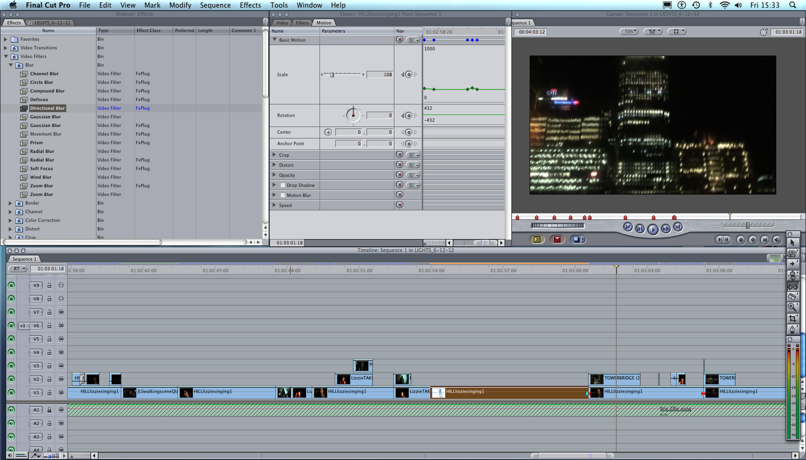
Motion/Motion Blur/Basic motion:
Through the use of Motion Blur we were able to create an exaggerate motion blur

Earthquake:
The earthquake effect gave some of our still shots some effective movement which we believed applied well to the style/sound of the song in which the shot was placed. We used it mainly for the echo/repeats of the singing so that the visuals had a relationship with the sound.

Soft Glow:
The soft glow allowed us to apply a more soft effect/glow over our shots, such as enhancing the light / bokeh movements and lightening any imperfections (e.g. uneven skin tone) on our actress/artists skin.

Brightness and Contrast:
The Brightness and contrast was used in most of our footage as alot of the footage needing adjusting to change the intensity of the light/darkness and colours in the shot.

Radial Blur:
The use of this was to have the clip create the illusion that the image was spinning. This was added to the Bokeh shots of the car lighting so that it was more defined and looked more creative.

Defocus
Blurs an image while creating a controlled glow effect in brighter areas of the image. This results in the image structure being shaped around the highlights of the image. This shape of the glow around the highlighted area can be altered. This was used filter when we blurred one image to match video other clips used. 

Echo:
This was used to create the effect that the moving area of the image was leaving a streaking tail behind it as it moved slightly. This is done by repeating frames

Soft focus:
This was used when we were overlapping clips. The Strength parameter controls how much of the blurred image is added back to the original image, while other sliders let us control the overall, horizontal, and vertical amount of blur.
Cross dissolve:
In order to blend the end of a shot with the beguinning of the following shot, we used a transition know as 'cross dissolve' which allowed us to achieve a more smooth transition of the shots.

Over Lay of clips/Opacity:
In many of our shots, we changed the opacity of the shots, with one or more ontop on other shots to allow a mixture of two or more pieces of footage to be seen. We found this particularly effective for our music video because we were able to make it look alot more interesting and allowed us to build up the creative footage ontop of the visual footage of our music artist.

 Heres an example with the use of opacity/overlay of two shots. One of the shots flickered in time to the beat by cutting the shots so they were introduced in time with the fast paced beat.
Speed Change:
By adjusting the speed of particular shots (mainly speeding up of the motion) we were able to apply it better to the style of song. Since the song is fairly fast paced with a quick beat, applying speed enabled us to make the footage/shots look better with the music.
Manual Scale Adjustment:
For a longer piece of footage, Lauren and I decided to apply a bit more impact with the footage by representing the sound of the beat to the quick jump/zoom into the footage. This allowed us to make this particular piece have a relationship with the song. We applied points to the footage and adjusted them ( in and out of the zoom ) in time with the music so that it looked more appealing to the viewer and keep it in context.
Beginning and end shot:
In order to keep the music video flowing, we knew we had to keep the music video consistent. One of the key things we looked at was the start and end of the music video and how we could an effective start and ending point to the music video.
We linked our opening footage of the blurred lights for the ending, as we used the same shot for the beguinning and end, however, for the end shot we used the overlay of shots of our music artist with the same blurred light shot. We did use some effects/editing features to adjust the colour, brightness and contrast of both of the pieces of footage, as with most of the footage within our music video.


Brightness and Contrast:
The Brightness and contrast was used in most of our footage as alot of the footage needing adjusting to change the intensity of the light/darkness and colours in the shot.
To many of the footage we caught which was lacking brightness and intensity, we found this particular feature useful as we were able to adjust both features to improve the quality of the film.

Image control;Effects:
Some of the effects we used within the 'Image control' folder were 'Brightness and Contrast' 'Colour Balance'


Fade in/out:
We applied this particular transition to a few selected shots where we believed it was appropriate and would allow the music video to flow well with the music itself. We incorporated many quick cuts in the video, in order to keep with the time and pace of the song, but in some places where we felt it needed to blend from one shot into another, we used the fade in/out transition.


Colour Correction / Colour Balance:
We used the colour balance in shots where we believed it was either lacking in colour or the colour tone of the footage needed altering. The colour balance allowed us to use colour wheels for 'Balance' of colour and 'Hue'. When we perceived a shot to be lacking in colour or appearing a particular shade of colour which wasn't well suited, we were able to change the shot to the colour we believed to be suitable for the style of music video we were going for. Such as linking the colour of the orange/yellow shades of blurred lights with the natural shades of our 'music artists' face.


Prism:
The prism effect allowed us to apply the concept of 'Lights' into our video by giving a couple of our shots/footage an ultraviolet style. We found this effective because we were able to manage the intensity of the effect. We timed the growing strength/intensity of light as the powerful note kicks in; we were able to do this manually by adding in points and adjusting them in time.


Zoom blur:  
Zoom blur allowed us to distort some of our shots to look as if speed itself has been applied to the shot, distorting how it looks and making it look out of place.
 

Slit Tunnel:

Bloom and Soft Focus:
Applying the bloom effect over some of the shots enabled us to create a particular glow, particularly to our blurred light effects, enhancing the light itself and making it appeare more bold.


Bad TV:
The Bad T.V. effect was applied to a couple of shots because we believed it would be a suitable application to the shot and believed it fitted in well with the 'lights' concept - coming through as if it were a T.V. producing light. We also noticed it added more flare and movement than what it was originally - which would attract our audiences attention alot more.


Creation of the Introduction Banner using Motion:

 Once we decided what music channel our video would be shown on, we created a logo for this. We used Up Your Viva as our music channel therefore we used a similar logo to theres. Below is evidence of us editing our introduction banner.

 As a background image, we decided use one that we had taken with our camera as it had a very cool creative effect. The other reason was that we wanted to keep the banner consistent with the colours used in our music video.
 This image's opacity was turned down so that it was more discrete.
 We added text to display the Artist, Song title and the Record label.

 Here is the fonts list that we chose from. It was then saved as a PNG file.
 Motion:

To create the Introduction Banner to be used for the music video, Motion was used. When selecting the to create the project, the project preset that had to be used was PAL DV. This was because we were only creating a small motion under 250 frames. 

The PNG file was imported onto Motion to start creating the motion transitions.
Recording of the banner being moved up and down.
Recording being stopped one this is done ready to be saved.
Saving project as
Introduction Banner working